지난번 통계편에 이은 머신러닝문서입니다! 잘못된 내용이나 모호한 내용, 추가되어야하는 내용이 있으면 지적해주세요! 다들 시험에 합격하시길 바라요~
0. 목차
클릭시 해당 컨텐츠로 이동합니다.
목차
https://snowgot.tistory.com/181
ADP 빅분기 이론과 Python 모듈, 실습코드 정리 - 통계편
ADP 시험을 준비하기 위하여 정리했던 방법론과 코드를 저장합니다.빅분기는 범위가 더 좁지만 공통된 부분이 많습니다. 선형계획법이나 기타 내용은 저도 몰라서 못넣었습니다 🤣 잘못된 내용
snowgot.tistory.com
1. 모듈별 디렉토리 정리
- ADP 지원 버전: Python 3.7.(공지사항)
- ADP 기본제공 Python Package & version
pip install ipykernel=5.1.0
pip install numpy==1.12.6
pip install pandas==1.1.2
pip install scipy==1.7.3
pip install matplotlib==3.0.3
pip install seaborn==0.9.0
pip install statsmodels==0.13.2
pip install scikit-learn==0.23.2
pip install imbalanced-learn==0.5.0
[제34회ADP실기]기본제공_python_package_list.txt
0.01MB
2. 머신러닝 - 지도학습
- 전체 프로세스
- 데이터 로딩 및 탐색
- 결측치 처리
- 이상치 탐지 및 처리
- 범주형 변수 인코딩
- 데이터 스케일링
- 불균형 데이터 처리
- 모델링 및 성능 평가
2.1. 결측치 처리 방법
| 방법 | 설명 | 예시 |
| 제거 | 결츷치가 적을 경우 | df.dropna() |
| 평균/중앙값 대치 | 연속형 변수 | df['column'].fillna(_mean) |
| 최빈값 대치 | 범주형 변수 | df['column'].fillna(_mode) |
| KNN Imputer | 패턴 반영대체 | from sklearn.impute import KNNImputer |
| Simple Imputer | 간단한 대치 | from sklearn.impute import SimpleImputer |
- KNN 대치
from sklearn.impute import KNNImputer
imputer = KNNImputer(n_neighbors= 2)
y = df[['y']]
X = df.drop(columns= 'y')
X_impute = imputer.fit_transform(X)

#fit_transform결과가 ndarray로 나오므로 데이터프레임으로 원복
pd.DataFrame(X_impute, columns = X.columns, index = df.index)- Simple Imputer 대치
import numpy as np
from sklearn.impute import SimpleImputer
imp_mean = SimpleImputer(missing_values=np.nan, strategy='mean')
imp_mean.fit([[7, 2, 3], [4, np.nan, 6], [10, 5, 9]])
SimpleImputer()
X = [[np.nan, 2, 3], [4, np.nan, 6], [10, np.nan, 9]]
print(imp_mean.transform(X))

[[ 7.   2.   3. ]
 [ 4.   3.5  6. ]
 [10.   3.5  9. ]]
2.2. 이상치 처리 방법
| 기법 | 설명 | 예시 |
| IQR 방식 | 사분위수 기반 | Q1 - 1.5*IQR, Q3 + 1.5*IQR |
| Z-score | 표준정규분포 기반 | abs(z) > 3 |
| 시각화 | boxplot, scatter 사용 | sns.boxplot( x= df['col']) |
- IQR을 이용한 이상치 처리
import numpy as np
# 1. IQR(Interquartile Range) 방법을 이용한 이상치 탐지
def detect_outliers_iqr(df, col):
    Q1 = df[col].quantile(0.25)
    Q3 = df[col].quantile(0.75)
    IQR = Q3 - Q1
    lower_bound = Q1 - 1.5 * IQR
    upper_bound = Q3 + 1.5 * IQR
    return df[(df[col] < lower_bound) | (df[col] > upper_bound)]

# 각 수치형 변수별 이상치 확인
for col in df_impute_X.columns:
    outliers = detect_outliers_iqr(df_impute_X, col)
    print(f'Column {col} has {len(outliers)} outliers')

# 2. 이상치 처리 방법
# 방법 1: 상한/하한 경계값으로 대체 (Capping)
def treat_outliers_capping(df, col):
    Q1 = df[col].quantile(0.25)
    Q3 = df[col].quantile(0.75)
    IQR = Q3 - Q1
    lower_bound = Q1 - 1.5 * IQR
    upper_bound = Q3 + 1.5 * IQR
    df[col] = np.where(df[col] < lower_bound, lower_bound, df[col])
    df[col] = np.where(df[col] > upper_bound, upper_bound, df[col])
    return df

# 수치형 변수에 대해 이상치 처리
data_cleaned_cap = df_impute_X.copy()
for col in df_impute_X.columns:
    data_cleaned_cap = treat_outliers_capping(data_cleaned_cap, col)

# 방법 2: 이상치가 있는 행 제거 (데이터가 충분할 경우만)
def remove_outliers(df, cols):
    df_clean = df.copy()
    for col in cols:
        Q1 = df[col].quantile(0.25)
        Q3 = df[col].quantile(0.75)
        IQR = Q3 - Q1
        lower_bound = Q1 - 1.5 * IQR
        upper_bound = Q3 + 1.5 * IQR
        df_clean = df_clean[(df_clean[col] >= lower_bound) & (df_clean[col] <= upper_bound)]
    return df_clean

# 중요 변수에 대해서만 이상치 행 제거 (모든 변수에 적용하면 데이터 손실이 클 수 있음)
important_numeric_cols = ['ALB', 'ALP', 'ALT', 'AST', 'BIL', 'CHE', 'CHOL', 'CREA', 'GGT', 'PROT']
data_no_outliers = remove_outliers(df_impute_X, important_numeric_cols)
display(data_no_outliers)
2.3. 범주형 변수인코딩
| 방법 | 예시 | 비고 |
| Label Encoding | 순서형 변수 | from sklearn.preprocessing import LabelEncoder |
| One-hot Encoding | 명목형 변수 | import pd pd.get_dummies() |
- Label Encoding 방법
from sklearn import preprocessing
le = preprocessing.LabelEncoder()
le.fit([1, 2, 2, 6])
LabelEncoder()
le.classes_
#array([1, 2, 6])
le.transform([1, 1, 2, 6])
#array([0, 0, 1, 2]...)
2.3. 데이터 시각화
sns.heatmap(df.corr(), annot= True, cmap = "YlGnBu" )2.4. PCA
- 차원축소기법으로 데이터의 분산을 최대한 보존하면서 고차원이 데이터를 저차원으로 변환
- 판단 기준
- 분산 설명률: 80~90%의 분산을 설명하는데 필요한 주성분이 원래 특성 수의 절반 이하인가?
- 모델 성능: PCA적용 후 모델 성능이 유지되거나 향상되었는가?
- 다중공선성: 원본 특성간에 높은 상관관계가 많이 존재하는가?
- 절차
- 결측치, 이상치 처리, 원-핫 인코딩 사전 진행
- 스케일링
- PCA 적용
- 설명된 분산확인 및 분산비율 시각화
- 적절한 주성분의 갯수 선택
- 선택된 주성분의 갯수로 PCA다시 적용
- 각 주성분이 원래 특성에 얼마나 기여하는지 확인
- 상위 5개 특성확인
from sklearn.decomposition import PCA
import matplotlib.pyplot as plt
import numpy as np
import pandas as pd
from sklearn.preprocessing import StandardScaler

# 데이터는 이미 전처리되었다고 가정 (결측치, 이상치 처리, 원-핫 인코딩 등)
# X는 전처리된 특성 데이터

# 1. 스케일링 (PCA 적용 전 반드시 필요)
scaler = StandardScaler()
X_scaled = scaler.fit_transform(X)

# 2. PCA 적용
pca = PCA()
X_pca = pca.fit_transform(X_scaled)

# 3. 설명된 분산 비율 확인
explained_variance_ratio = pca.explained_variance_ratio_
cumulative_variance_ratio = np.cumsum(explained_variance_ratio)

# 4. 설명된 분산 비율 시각화
plt.figure(figsize=(10, 6))
plt.plot(range(1, len(explained_variance_ratio) + 1), cumulative_variance_ratio, marker='o', linestyle='-')
plt.xlabel('Number of Principal Components')
plt.ylabel('Cumulative Explained Variance Ratio')
plt.title('Explained Variance by Components')
plt.axhline(y=0.8, color='r', linestyle='--', label='80% Variance Threshold')
plt.axhline(y=0.9, color='g', linestyle='--', label='90% Variance Threshold')
plt.legend()
plt.grid(True)
plt.show()

# 5. 적절한 주성분 개수 선택 (예: 80% 분산 유지)
n_components = np.argmax(cumulative_variance_ratio >= 0.8) + 1
print(f"80% 분산을 유지하기 위한 주성분 개수: {n_components}")

# 6. 선택된 주성분 개수로 PCA 다시 적용
pca_selected = PCA(n_components=n_components)
X_pca_selected = pca_selected.fit_transform(X_scaled)

# 7. 각 주성분이 원래 특성에 얼마나 기여하는지 확인
components_df = pd.DataFrame(
    pca_selected.components_,
    columns=X.columns
)

# 8. 각 주성분에 대한 기여도가 높은 상위 5개 특성 확인
for i, component in enumerate(components_df.values):
    sorted_indices = np.argsort(np.abs(component))[::-1]
    top_features = [X.columns[idx] for idx in sorted_indices[:5]]
    top_values = [component[idx] for idx in sorted_indices[:5]]
    print(f"PC{i+1} 주요 특성:")
    for feature, value in zip(top_features, top_values):
        print(f"  {feature}: {value:.4f}")
    print()

# 9. 2D 시각화 (처음 두 개 주성분으로)
plt.figure(figsize=(10, 8))
plt.scatter(X_pca[:, 0], X_pca[:, 1], c=y, cmap='viridis', alpha=0.8)
plt.title('First Two Principal Components')
plt.xlabel('PC1')
plt.ylabel('PC2')
plt.colorbar(label='Target Class')
plt.grid(True)
plt.show()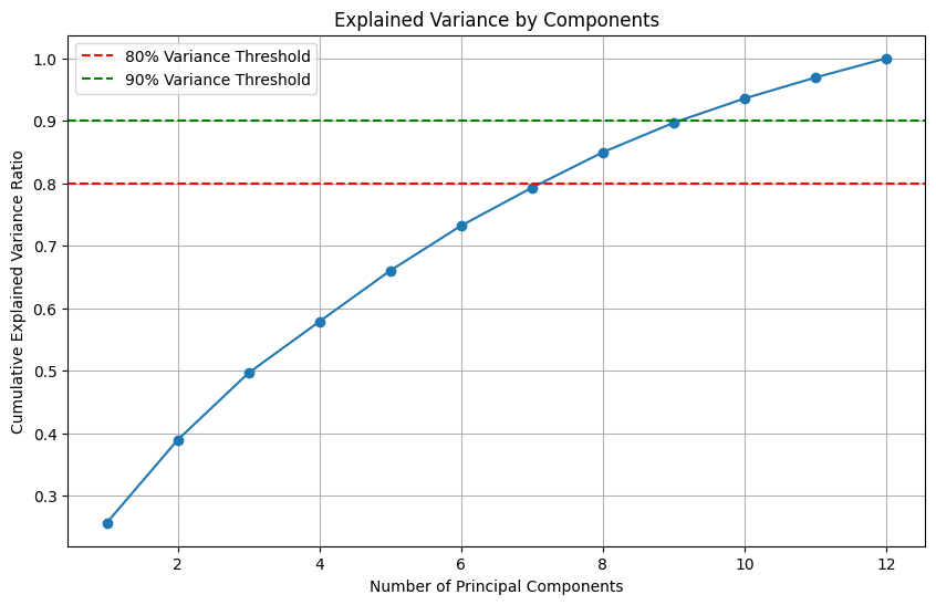

- 판단근거1: 설명된 분산비율
- 하기의 누적분산 비율이 총 컬럼 12개에서 7개를 담아야지 80%를 설명하므로 차원축소가 효과적이지 않다는 판단 가능
# 누적 설명된 분산 비율을 확인
print("각 주성분별 설명된 분산 비율:")
for i, ratio in enumerate(explained_variance_ratio):
    print(f"PC{i+1}: {ratio:.4f}")

print("\n누적 설명된 분산 비율:")
for i, ratio in enumerate(cumulative_variance_ratio):
    print(f"PC1-PC{i+1}: {ratio:.4f}")


각 주성분별 설명된 분산 비율:
PC1: 0.2566
PC2: 0.1327
PC3: 0.1071
PC4: 0.0823
PC5: 0.0815
PC6: 0.0719
PC7: 0.0608
PC8: 0.0567
PC9: 0.0472
PC10: 0.0388
PC11: 0.0335
PC12: 0.0308

누적 설명된 분산 비율:
PC1-PC1: 0.2566
PC1-PC2: 0.3893
PC1-PC3: 0.4964
PC1-PC4: 0.5787
PC1-PC5: 0.6602
PC1-PC6: 0.7321
PC1-PC7: 0.7930
PC1-PC8: 0.8497
PC1-PC9: 0.8969
PC1-PC10: 0.9357
PC1-PC11: 0.9692
PC1-PC12: 1.0000- 스크리 플롯(Scree Plot)
- Elbow 지점 확인: 대략 4번 지점이 후보군
plt.figure(figsize=(10, 6))
plt.plot(range(1, len(explained_variance_ratio) + 1), explained_variance_ratio, marker='o', linestyle='-')
plt.xlabel('Principal Component')
plt.ylabel('Explained Variance Ratio')
plt.title('Scree Plot')
plt.grid(True)
plt.show()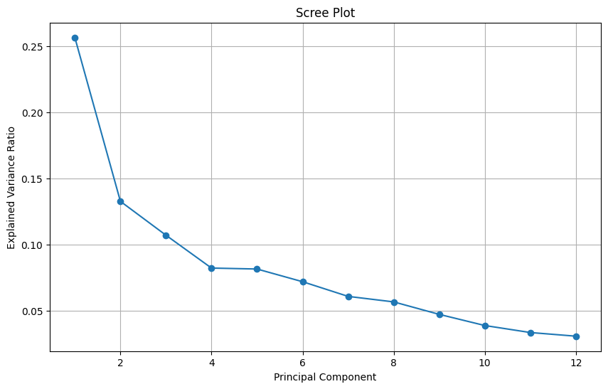
- 원본데이터와 PCA데이터 성능비교
- cross_val_score의 경우 이진 분류만 가능하기에 다중클래스는 안됨(변환 필요)
from sklearn.model_selection import cross_val_score
from sklearn.ensemble import RandomForestClassifier

# 원본 스케일링된 데이터에 대한 교차 검증
clf_original = RandomForestClassifier(random_state=42)
scores_original = cross_val_score(clf_original, X_scaled, y, cv=5, scoring='roc_auc')

# PCA 적용 데이터에 대한 교차 검증
clf_pca = RandomForestClassifier(random_state=42)
scores_pca = cross_val_score(clf_pca, X_pca_selected, y, cv=5, scoring='roc_auc')

print(f"원본 데이터 평균 ROC-AUC: {scores_original.mean():.4f} (±{scores_original.std():.4f})")
print(f"PCA 데이터 평균 ROC-AUC: {scores_pca.mean():.4f} (±{scores_pca.std():.4f})")- 다중공선성 검사
- 특성간 높은 상관관계 발견(0.7 이상) 되면 PCA가 유용할 수 있음
- 해당 높은 특성들은 독립적인 주성분으로 변환
from sklearn.preprocessing import StandardScaler
from scipy.stats import spearmanr
import seaborn as sns

# 상관관계 행렬 계산
correlation_matrix = X.corr()

# 상관관계 히트맵 표시
plt.figure(figsize=(12, 10))
sns.heatmap(correlation_matrix, annot=False, cmap='coolwarm', center=0)
plt.title('Feature Correlation Matrix')
plt.tight_layout()
plt.show()

# 높은 상관관계(0.7 이상)를 가진 특성 쌍 찾기
high_corr_pairs = []
for i in range(len(correlation_matrix.columns)):
    for j in range(i+1, len(correlation_matrix.columns)):
        if abs(correlation_matrix.iloc[i, j]) > 0.7:
            high_corr_pairs.append((correlation_matrix.columns[i], correlation_matrix.columns[j], correlation_matrix.iloc[i, j]))

print("높은 상관관계를 가진 특성 쌍:")
for pair in high_corr_pairs:
    print(f"{pair[0]} - {pair[1]}: {pair[2]:.4f}")
2.3. 스케일링
| 방법 | 설명 | 특장점 |
| Standard Scaler(정규화) | 각 데이터에 평균을 뺴고 표준편차 나누기 (x - x_bar / x_std) |
이상치, 분포가 skewed되어있을때 |
| MinMax Scaler(표준화) | 데이터를 0과 1사이로 조정 ( x- x_min / x_max - x_min) |
이상치에 영향을 많이 받음 |
| Robust Scaler | 중앙 값과 IQR를 이용해 조정 (x - median / IQR) |
이상치에 덜 민감 |
- 정규화 스케일링
from sklearn.preprocessing import StandardScaler
data = [[0, 0], [0, 0], [1, 1], [1, 1]]
scaler = StandardScaler()
print(scaler.fit(data))
StandardScaler()
print(scaler.mean_)
#[0.5 0.5]
print(scaler.transform(data))
#[[-1. -1.]
# [-1. -1.]
# [ 1.  1.]
# [ 1.  1.]]
2.4. 데이터 샘플링
| 방법 | 설명 | 사용법 |
| 언더샘플링 | 다수 클래스 줄임 | from imblearn.under_sampling import RandomUnderSampler SMOTE 클래스 대신 사용하면 됨 |
| 오버샘플링 | 소수 클래수 복제 | SMOTE |
| 클래스 가중치 | 모델이 직접 적용, 데이터가 작아 오버샘플링이 부담스러울 때 | class_weight = 'balanced' (Logistic, RF, SVC, GBC 등 지원) |
- SMOTE 코드
from imblearn.over_sampling import SMOTE

X = df.drop(columns=['Category', 'target'])
y = df['target']
smote = SMOTE(random_state = 42)
X_resampled, y_resampled = smote.fit_resample(X, y)
2.4. 평가지표 metrics
| 메트릭 | 설명 | 사용시점 |
| Precision | Positive 예측 한 것 중 실제 Positive | FP가 중요한 문제(스팸 필터처럼 잘못 걸러내면 안됄 때) |
| Recall(Sensitivity) | 실제 Positive중 Positive로 예측한 비율 | FN가 중요힌 문제(암 진단처럼 놓지면 안될 때) |
| F1-score | Precision과 Recall의 조화 평균 | 둘 다 중요할 때 |
| AUC-ROC | 다양한 threshhold에서 TPR vs FPR 곡선의 아래 면적 | 전체적인 분류 성능이 중요할 때 |
| PR-AUC | Precision vs Recall 곡선의 면적 | 불균형이 매우 심하여 Positive가 극소수 일때 |
- 메트릭 코드 모음

# 분류모델
from sklearn.metrics import accuracy_score, precision_score,recall_score
from sklearn.metrics import f1_score, confusion_matrix, roc_auc_score, classification_report
# 회귀모델
from sklearn.metrics import mean_squared_error, mean_absolute_error
from sklearn.metrics import r2_score, adjusted_rand_score

# 비지도학습 군집
from sklearn.metrics import silhouette_score- classification_report 읽기
- support: 해당 클래스의 샘플 수
- macro avg: 일반적인 지표
- weight avg: 샘플수 가중치를 더한 지표

- ROC Curve
import matplotlib.pyplot as plt
from sklearn.metrics import roc_curve, roc_auc_score

# 모델 학습 (예시)
model = RandomForestClassifier(random_state=42)
model.fit(X_train, y_train)

# 테스트 데이터에 대한 예측 확률
y_pred_proba = model.predict_proba(X_test)[:, 1]  # 양성 클래스(1)에 대한 확률

# ROC 커브 계산
fpr, tpr, thresholds = roc_curve(y_test, y_pred_proba)

# AUC 계산
roc_auc = roc_auc_score(y_test, y_pred_proba)

# ROC 커브 그리기
plt.figure()
plt.plot(fpr, tpr, color='blue', label=f'ROC curve (AUC = {roc_auc:.2f})')
plt.plot([0, 1], [0, 1], color='gray', linestyle='--')  # 대각선 기준선
plt.xlim([0.0, 1.0])
plt.ylim([0.0, 1.05])
plt.xlabel('False Positive Rate')
plt.ylabel('True Positive Rate')
plt.title('Receiver Operating Characteristic')
plt.legend(loc="lower right")
plt.show()
2.5. 머신러닝 스켈레톤 코드 - 분류
from sklearn.linear_model import LogisticRegression
from sklearn.ensemble import RandomForestClassifier
from sklearn.svm import SVC
from sklearn.model_selection import train_test_split

X = df.drop(columns = ['Kwh8','date','datetime'])
y = df['Kwh8']

X_train, X_test, y_train, y_test = train_test_split(X,y, random_state= 42, stratify= y, test_size= 0.2)
print(X_train.shape, X_test.shape, y_train.shape, y_test.shape)

# 모델 리스트와 이름
models = [
	('Logistic', LogisticRegression(solver='liblinear')), #sklearn 0.23. 에러 대응
    ('RandomForest', RandomForestClassifier(random_state=42)),
    ('SVM', SVC(random_state=42))
]

# 모델 학습 및 평가
for model_name, model in models:
    model.fit(X_train, y_train)

    # 예측 수행
    y_pred_train = model.predict(X_train)
    y_pred_test = model.predict(X_test)

    # 성능 평가 (train)
    print(f'Train - {model_name} Model')
    print(classification_report(y_train, y_pred_train))

    # 성능 평가 (test)
    print(f'Test - {model_name} Model')
    print(classification_report(y_test, y_pred_test))
2.5. 머신러닝 스켈레톤 코드 - 분류(cv)
from sklearn.metrics import classification_report, accuracy_score
from sklearn.model_selection import cross_val_score, KFold, StratifiedKFold

# 데이터 분할
X_train, X_test, y_train, y_test = train_test_split(X, y, random_state=42, stratify=y, test_size=0.3)
print(X_train.shape, X_test.shape, y_train.shape, y_test.shape)

# 교차 검증 설정
cv = StratifiedKFold(n_splits=5, shuffle=True, random_state=42)

# 모델 리스트와 이름
models = [
    ('Logistic', LogisticRegression(solver='liblinear')), #sklearn 0.23. 에러 대응
    ('RandomForest', RandomForestClassifier(random_state=42)),
    ('SVM', SVC(random_state=42))
]

# 모델 학습 및 평가
for model_name, model in models:
    # 교차 검증 수행
    cv_scores = cross_val_score(model, X_train, y_train, cv=cv, scoring='accuracy')
    print(f'\n{model_name} Cross-Validation:')
    print(f'CV Scores: {cv_scores}')
    print(f'Mean CV Score: {cv_scores.mean():.4f} ± {cv_scores.std():.4f}')

    # 전체 훈련 데이터로 모델 학습
    model.fit(X_train, y_train)

    # 예측 수행
    y_pred_train = model.predict(X_train)
    y_pred_test = model.predict(X_test)

    # 성능 평가 (train)
    print(f'\nTrain - {model_name} Model')
    print(classification_report(y_train, y_pred_train))

    # 성능 평가 (test)
    print(f'\nTest - {model_name} Model')
    print(classification_report(y_test, y_pred_test))

    print('-' * 70)

# 다양한 교차 검증 방법 비교 (선택적)
print("\n다양한 교차 검증 방법 비교 (RandomForest 모델):")
cv_methods = {
    'KFold (k=5)': KFold(n_splits=5, shuffle=True, random_state=42),
    'StratifiedKFold (k=5)': StratifiedKFold(n_splits=5, shuffle=True, random_state=42),
    'StratifiedKFold (k=10)': StratifiedKFold(n_splits=10, shuffle=True, random_state=42)
}

rf_model = RandomForestClassifier(random_state=42)
for cv_name, cv_method in cv_methods.items():
    cv_scores = cross_val_score(rf_model, X_train, y_train, cv=cv_method, scoring='accuracy')
    print(f'{cv_name}: {cv_scores.mean():.4f} ± {cv_scores.std():.4f}')
2.6. 종속변수에 영향 해석하기
- 로지스틱 회귀 베타계수 추정
- 양수는 변수가 증가감에 따라 간염 화률의 증가, 음수는 감소
- 로즈오즈 해석: 계수가 0.5이면 1단위 증가할 때 간염 발생 로그오즈 0.05 증가
- 오즈비 해석: exp(계수)값으로 계산하며 1.5이면 변수 1단위 증가할 때 간염 발생 오즈 50% 증가 0.8이면 20% 감소, 1이면 영향 미치지 않음
# 로지스틱 회귀 모델 학습
log_model = LogisticRegression(solver='liblinear')
log_model.fit(X_train, y_train)

# 계수 및 변수명 가져오기
coefficients = log_model.coef_[0]
feature_names = X.columns

# 계수 크기순으로 정렬하여 출력
coef_df = pd.DataFrame({'Feature': feature_names, 'Coefficient': coefficients})
coef_df = coef_df.sort_values('Coefficient', ascending=False)
print("로지스틱 회귀 계수 (양수=간염 위험 증가, 음수=간염 위험 감소):")
print(coef_df)

# 오즈비(Odds Ratio) 계산 - 해석이 더 직관적임
coef_df['Odds_Ratio'] = np.exp(coef_df['Coefficient'])
print("\n오즈비 (1보다 크면 위험 증가, 1보다 작으면 위험 감소):")
print(coef_df[['Feature', 'Odds_Ratio']])- Feature Importance
# Random Forest 모델 학습
rf_model = RandomForestClassifier(random_state=42)
rf_model.fit(X_train, y_train)

# 특성 중요도 추출 및 시각화
importances = rf_model.feature_importances_
indices = np.argsort(importances)[::-1]

feature_importance_df = pd.DataFrame({
    'Feature': feature_names[indices],
    'Importance': importances[indices]
})

plt.figure(figsize=(10, 6))
sns.barplot(x='Importance', y='Feature', data=feature_importance_df[:10])
plt.title('Top 10 Important Features for Hepatitis Prediction (Random Forest)')
plt.tight_layout()
plt.show()- SHAP value
- 게임 이론이 기반, 각 특성이 모델 예측에 미치는 기여도를 배분
- 양수면 해당 특성이 예측 확률을 증가시키는 방향으로 기여, 음수는 감소시키는 방향으로 기여
- 개별 예측 분석, 상호작용 효과 파악, 모든 모델에 적용할 수 있는 장점
#!pip install shap
import shap

# SHAP 값 계산 (예: Random Forest 모델)
explainer = shap.TreeExplainer(rf_model)
shap_values = explainer.shap_values(X_test)

# SHAP 값 요약 시각화
shap.summary_plot(shap_values, X_test, feature_names=feature_names)
2.6. tensorflow 1.13.1 기준 지도학습 코드
import tensorflow as tf
import numpy as np
import os

# TensorFlow 1.x 환경에서 Eager Execution을 비활성화
tf.compat.v1.disable_eager_execution()

# 데이터 생성 (이진 분류용)
X_data = np.random.rand(100, 2)  # 100개의 샘플, 2개의 특성
y_data = np.random.randint(2, size=(100, 1))  # 100개의 이진 타겟 값 (0 또는 1)

# 모델 정의 (Sequential API)
model = tf.keras.models.Sequential()
model.add(tf.keras.layers.Dense(10, input_dim=2, activation='relu'))  # 은닉층
model.add(tf.keras.layers.Dense(1, activation='sigmoid'))  # 이진 분류를 위한 sigmoid 출력층

# 모델 컴파일
model.compile(optimizer='adam', loss='binary_crossentropy', metrics=['accuracy'])

# 체크포인트 설정
checkpoint_path = "training_checkpoints/cp.ckpt"
checkpoint_dir = os.path.dirname(checkpoint_path)

# 체크포인트 콜백 설정
cp_callback = tf.keras.callbacks.ModelCheckpoint(filepath=checkpoint_path,
                                                 save_weights_only=True,
                                                 verbose=1)
# 모델 학습 (체크포인트 콜백 적용)
model.fit(X_data, y_data, epochs=10, batch_size=10, callbacks=[cp_callback])
# 모델 저장 (전체 모델 저장)
model.save('saved_model/my_model')
# 모델 불러오기
new_model = tf.keras.models.load_model('saved_model/my_model')
# 불러온 모델 평가
loss, accuracy = new_model.evaluate(X_data, y_data)
print(f"불러온 모델 정확도: {accuracy:.4f}")
# 체크포인트에서 가중치만 불러오기
new_model.load_weights(checkpoint_path)
# 불러온 체크포인트의 가중치로 다시 평가
loss, accuracy = new_model.evaluate(X_data, y_data)
print(f"체크포인트에서 불러온 모델 정확도: {accuracy:.4f}")
# 분류 예측
predictions = new_model.predict(X_data)
print(f"예측값 (0 또는 1로 변환): \n{(predictions > 0.5).astype(int)}")
3. 머신러닝 - 비지도학습
3.1. Kmeans
import pandas as pd
from sklearn.cluster import KMeans

# KMeans 설정 및 클러스터링 수행
kmeans = KMeans(n_clusters=3, random_state=42)
kmeans.fit(data)

# 클러스터 결과를 데이터프레임에 추가
data['cluster'] = kmeans.labels_

# 결과 확인
print(data.head())
3.2. DBSCAN
import pandas as pd
from sklearn.cluster import DBSCAN

# DBSCAN 설정 및 클러스터링 수행
dbscan = DBSCAN(eps=0.5, min_samples=5)
dbscan.fit(data)

# 클러스터 결과를 데이터프레임에 추가
data['cluster'] = dbscan.labels_

# 결과 확인
print(data.head())
3.3. Elbow method
# 클러스터 수에 따른 inertia (군집 내 거리 합) 계산
inertia = []
K = range(1, 11)  # 1~10개의 클러스터를 테스트
for k in K:
    kmeans = KMeans(n_clusters=k, random_state=42)
    kmeans.fit(data)
    inertia.append(kmeans.inertia_)

# Elbow Method 그래프 시각화
plt.figure(figsize=(8, 6))
plt.plot(K, inertia, 'bx-')
plt.xlabel('Number of clusters (k)')
plt.ylabel('Inertia')
plt.title('Elbow Method For Optimal k')
plt.show()
3.4. 실루엣 계수
from sklearn.metrics import silhouette_score

# 실루엣 계수를 저장할 리스트
silhouette_avg = []

# 2~10개의 클러스터를 테스트
K = range(2, 11)
for k in K:
    kmeans = KMeans(n_clusters=k, random_state=42)
    labels = kmeans.fit_predict(data)
    silhouette_avg.append(silhouette_score(data, labels))

# 실루엣 계수 시각화
plt.figure(figsize=(8, 6))
plt.plot(K, silhouette_avg, 'bx-')
plt.xlabel('Number of clusters (k)')
plt.ylabel('Silhouette Score')
plt.title('Silhouette Score For Optimal k')
plt.show()
4. 생존 분석
생존분석 정리글입니다.
https://snowgot.tistory.com/137
생존분석과 lifeline 패키지 활용 - LogRank, 카플란-마이어, 콕스비례위험모형
1. 생존분석이란시간-이벤트 데이터(예: 생존 시간, 고장 시간 등)를 분석하는 데 사용됨주요 목표는 생존 시간 분포를 추정하고, 생존 시간에 영향을 미치는 요인을 식별하며, 여러 그룹 간의 생
snowgot.tistory.com
4.1. 생존 분석 분류
- 생존 분석: 다양한 모델링 기법을 포함하는 광범위한 분야로, 시간-이벤트 데이터를 분석
- 카플란-마이어 추정법: 특정 시간까지 이벤트가 발생하지 않을 확률을 추정하는 방법입니다. 사건이 독립적이라는 가정
- Log-Rank 테스트: 두 그룹 간의 시간에 따른 생존율 차이를 검정
- 콕스 비례 위험 모형: 시간에 따른 위험을 모델링하며, 공변량이 시간에 따라 비례적으로 위험률에 영향을 미친다는 가정을 기반
4.2. 카플란 마이어
- 특정 시간까지 이벤트가 발생하지 않을 확률(생존 함수)을 비모수적으로 추정하는 방법
- 각 시간 점에서 생존 확률을 계산하고, 이를 통해 전체 생존 곡선을 작성.
- 사건이 독립적이라는 가정이 있지만, 실제로는 이 가정이 항상 만족되지 않을 수 있음(실제로 병은 누적되는 대미지가 있으므로)
- $\hat{S}(t) = \prod_{t_i \leq t} \left(1 - \frac{d_i}{n_i}\right)$

import pandas as pd
import matplotlib.pyplot as plt
from lifelines import KaplanMeierFitter

# 예시 데이터 생성
data = {
    'duration': [5, 6, 6, 7, 8, 8, 10, 12, 14, 15, 18, 20, 25],
    'event': [1, 1, 0, 1, 1, 0, 1, 1, 1, 0, 1, 1, 1]
}

df = pd.DataFrame(data)

# Kaplan-Meier Fitter 생성
kmf = KaplanMeierFitter()

# 생존 함수 적합
kmf.fit(durations=df['duration'], event_observed=df['event'])

# 생존 곡선 시각화
plt.figure(figsize=(10, 6))
kmf.plot_survival_function()
plt.title('Kaplan-Meier Survival Curve')
plt.xlabel('Time')
plt.ylabel('Survival Probability')
plt.grid(True)
plt.show()
4.3. Log-Rank
- 카플란 마이어 기법의 응용
- 두 그룹 간의 시간에 따른 생존율 차이를 검정하는 방법
- 각 시간 점에서 관찰된 사건 수와 기대 사건 수를 비교하여(카이제곱검정), 두 그룹의 생존 곡선이 통계적으로 유의미하게 다른지를 평가
- $\chi^2 = \frac{(O_1 - E_1)^2}{V_1} + \frac{(O_2 - E_2)^2}{V_2}$

import pandas as pd
from lifelines import KaplanMeierFitter
from lifelines.statistics import logrank_test

# 데이터 생성
data = {
    'group': ['A', 'A', 'A', 'A', 'A', 'B', 'B', 'B', 'B', 'B'],
    'duration': [6, 7, 10, 15, 23, 5, 8, 12, 18, 22],
    'event': [1, 0, 1, 0, 1, 1, 1, 0, 1, 1]
}

df = pd.DataFrame(data)

# 두 그룹 나누기
groupA = df[df['group'] == 'A']
groupB = df[df['group'] == 'B']

# Kaplan-Meier Fitter 생성
kmf_A = KaplanMeierFitter()
kmf_B = KaplanMeierFitter()

# 생존 함수 적합
kmf_A.fit(durations=groupA['duration'], event_observed=groupA['event'], label='Group A')
kmf_B.fit(durations=groupB['duration'], event_observed=groupB['event'], label='Group B')

# Log-Rank 테스트 수행
results = logrank_test(groupA['duration'], groupB['duration'], event_observed_A=groupA['event'], event_observed_B=groupB['event'])
results.print_summary()
- 시각화 코드
import pandas as pd
import matplotlib.pyplot as plt
from lifelines import KaplanMeierFitter

# 데이터 생성
data = {
    'group': ['A', 'A', 'A', 'A', 'A', 'B', 'B', 'B', 'B', 'B'],
    'duration': [6, 7, 10, 15, 23, 5, 8, 12, 18, 22],
    'event': [1, 0, 1, 0, 1, 1, 1, 0, 1, 1]
}

df = pd.DataFrame(data)

# 두 그룹 나누기
groupA = df[df['group'] == 'A']
groupB = df[df['group'] == 'B']

# Kaplan-Meier Fitter 생성
kmf_A = KaplanMeierFitter()
kmf_B = KaplanMeierFitter()

# 생존 함수 적합
kmf_A.fit(durations=groupA['duration'], event_observed=groupA['event'], label='Group A')
kmf_B.fit(durations=groupB['duration'], event_observed=groupB['event'], label='Group B')

# 생존 곡선 시각화
plt.figure(figsize=(10, 6))
kmf_A.plot_survival_function()
kmf_B.plot_survival_function()
plt.title('Kaplan-Meier Survival Curves')
plt.xlabel('Time (months)')
plt.ylabel('Survival Probability')
plt.legend()
plt.grid(True)
plt.show()
4.4. 콕스비레 위험모형
- 카플란마이어 추정법은 사건이 독립적이라는 가정의 한계 따라서 시간에 따른 사건 발생 위험률(위험 함수)을 모델링
- 공변량(독립변수)이 시간에 따라 비례적으로 위험률에 영향을 미친다는 가정
- 기준 위험률와 공변량의 선형 결합을 지수 함수 형태로 결합하여 위험률을 표현
- 기준위험률(λ0(t)): 시간 t 기준 위험률로 공변량의 영향을 제거한 상태의 기본적인 위험률
- 공변량(Covariates, X): 사건 발생에 영향을 미칠 수 있는 변수들
- 시간-의존적 위험률을 모델링할 수 있으며, 공변량이 생존 시간에 미치는 영향을 평가하는 데 유용
- $\lambda(t \mid X) = \lambda_0(t) \exp(\beta_1 X_1 + \beta_2 X_2 + \cdots + \beta_p X_p)$

import pandas as pd
from lifelines import CoxPHFitter
import matplotlib.pyplot as plt

# 예시 데이터 생성
```
duration: 환자가 생존한 기간(개월 수)
event: 사건 발생 여부(1 = 사망, 0 = 생존)
age: 환자의 나이
treatment: 치료 방법(0 = 치료 A, 1 = 치료 B)
```
data = {
    'duration': [5, 6, 6, 7, 8, 8, 10, 12, 14, 15, 18, 20, 25, 5, 7, 12, 13, 14, 16, 20],
    'event': [1, 1, 0, 1, 1, 0, 1, 1, 1, 0, 1, 1, 1, 1, 0, 1, 0, 1, 0, 1],
    'age': [50, 55, 60, 65, 70, 75, 80, 85, 90, 95, 100, 105, 110, 55, 60, 65, 70, 75, 80, 85],
    'treatment': [0, 0, 1, 0, 1, 1, 0, 1, 0, 1, 0, 1, 0, 0, 0, 1, 1, 0, 1, 1]
}

df = pd.DataFrame(data)

# 콕스 비례 위험 모형 적합
cph = CoxPHFitter()
cph.fit(df, duration_col='duration', event_col='event')

# 모형 요약 출력
cph.print_summary()

# 생존 곡선 시각화
cph.plot()
plt.title('Hazard Ratios')
plt.show()
'Data Science' 카테고리의 다른 글
| DataScience를 위한 엔지니어링 책 추천 (0) | 2025.05.21 |
|---|---|
| [월데노]🚥 횡단보도에 몇 명이 있어야 금방 신호가 파란색을 바뀔까? (2) | 2025.04.26 |
| ADP 빅분기 이론과 Python 모듈, 실습코드 정리 - 통계편 (1) | 2025.04.18 |
| 글쓰기 커뮤니티 글또, 참가자부터 운영진까지의 3년 간 회고 (1) | 2025.03.30 |
| 왜 프로덕트 팀은 A/B테스트를 사랑할까? (feat 인과추론) (1) | 2025.01.18 |